How can we design a car insurance platform that provides an ease of mind for drivers in the UAE?
Shory is a newly launched car insurance platform for drivers to compare, buy, and manage insurance across a variety of providers. They needed a distinct brand and product experience to deliver value in a highly competitive UAE market.
I was the UX design lead for this project:
Oversaw and guided the UX design team
Led discussions with Shory through workshops and weekly check-in's
Planned scope, timeline, and design tasks
Implemented a design system to scale and adapt to the evolution of the branding work that started in parallel with UX
Closely worked across the other internal tracks within MING Labs to deliver a cohesive experience
Shory
Project duration: 6 months
Platform: Web responsive + mobile app
MING Labs team:
UX Design
Kenneth Tay – UX Design Lead
Siying Ong – UX Designer
Martina Maitan – UX Designer
Yun Huang – UX Designer
Leanne Lim – UX Design Intern
Business Design
Elyas Munye – Business Design Lead
Brand Design
Andrea Cadorin – Creative Director
Fabio Buonocore – Illustrator
Content Design
Kristina Würz – UX Writer
Grace Tan – UX Writer


“The UAE is the number one place for scams”
– participant from qualitative interview
Prior qualitative interviews and business landscape studies done by the business design team immersed us into the UAE insurance landscape at an accelerated pace.
We learnt that the car insurance journey is fragmented and disjointed – drivers had to fill up a questionnaire on the website, follow up with brokers on WhatsApp, and then complete the remaining forms through email.
The heavy reliance on brokers and unofficial channels like WhatsApp also left drivers exposed to scams as they were required to send photo proofs of their IDs and other sensitive information.
Trustworthiness became a common theme, along with the need for simplicity and directness.

Shory’s landing pages, communicating the brand values of simplicity and trust
Shory connects you directly to official government and insurtech data systems

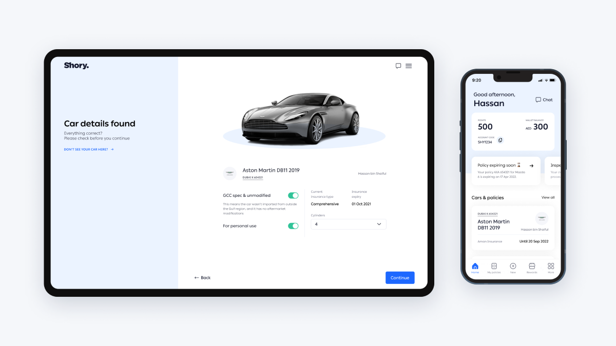
Shory’s initial screen mockups requested for the customer’s Emirates ID upfront, which we felt created a barrier to entry, compared with competitors who just asked for car details. We brought this up in our kick-off workshop.
It was there we learnt that Shory did this because they could connect to official data systems to retrieve both the driver and car details, eliminating the hassle of filling up a long questionnaire form and needing to send their personal details to a broker after.

We also learnt that they would be the only comparison platform in the UAE that retrieves accurate, real time quotations directly from insurance companies.
This new knowledge pivoted our focus to “How can we deliver this value proposition effectively?”

The pre-empts on how their data is being used and the upfront requests for it eventually leads to this ‘magical moment’ when the driver’s car details automatically appears after the system completes its data retrieval.
We wanted to celebrate this and create a “Wow, that’s my car!” moment by displaying their car as a hero image with central focus, evoking a sense of ownership as they continue on in the journey.
Direct, conversational, easy

The content design team established a voice & tone guide, speaking to the customer in second person to create a more conversational dynamic and used direct, natural language to reduce the complexity of the more technical questions.
This was also in line with the brand values we established of being honest and simple. In-context help was also availed to drivers in the more technical tasks.

“Am I selecting the best policy?”
Through our usability studies and industry insights from Shory, we gathered key indicators that drivers looked for when purchasing a policy. Things like brand name, repair type, Oman coverage. (Price, while important, was not their top consideration)
We surfaced these key indicators on the quote listings for easy scanning to help drivers make an informed decision.

As efficient as possible
Typically, a car insurance portal would only be accessed periodically for yearly renewals, claims, and other routine tasks. As such, we needed the experience to be as efficient as possible.
We employed a card carousel at the top of the dashboard to surface required tasks and important statuses, like expiring policies or vehicle inspections due. This enabled drivers to accomplish key tasks without even needing to navigate the UI.
Aligned to mental models

Filing a claim
In the UAE, you are required to get an accident report from the police when involved in an accident. This report was needed to file a claim.
We designed the entry fields to correspond with the order and structure of the accident report to make it more efficient and intuitive to fill up. For example, we designed the damage location field as an interactive diagram that matches the diagram on the accident report.

Your car as the point of reference
In Shory’s initial mock ups, they divided the user’s cars, policies, claims, and inspections into separate sections.
We revised this, using the car as the top level container that housed policies, claims, and inspections in secondary level containers.

We felt this aligned better with the driver’s mental model of associating with their car as the central item, providing a more natural navigation into the deeper layers of information and tasks related to the car.

Perhaps we were wrong...
While our hypothesis on the above tested well in the usability studies, after the pilot launch we learnt it could be confusing as drivers were expecting to see their policy appear on the dashboard after their purchase, and not their car.
We explored different dashboard designs that retained the car as the primary container but surfacing the policy cards instead. Work on this was still in progress at the time I stepped down from the project.

Setting the team up for success
Based on the screen mockups Shory gave us, I was able to assign realistic effort estimates to each flow and section. We learnt that the scope had been underestimated by quite a lot in the initial proposal.
We needed more than twice the time to realistically design an MVP product experience, which we were able to quantify through the effort estimates.
This gave the team the proper breathing room to execute, test, and refine each flow, ensuring we don’t kill ourselves on too tight of a timeline (which unfortunately is the more common scenario).

Testing our assumptions
We had 2 usability studies with 5-8 participants in the UAE across locals and expats, with varying driving experience.
This gave us valuable feedback to help us better understand the user behaviours and car/driver procedures in the UAE. The Shory team also sat in on the sessions, helping them learn first hand what works and what doesn’t.

Including the client on the journey
Notes and comments from each session were added directly in Figma beside the relevant screens, allowing both us to easily cross reference the issues in context to the particular areas in question.
The summary of findings and insights were also directly drafted on the file and shared with Shory, saving us time on doing a keynote report and allowing them to also walk their stakeholders through the design and participant comments.

A smooth scaling experience
With the branding track starting in parallel with the UX, we had to design our UI system in a way that easily scaled from wireframes to final visual design and supported any additional features that might come after.
We managed to achieve this, but with any large product, it is an ongoing housekeeping effort to maintain its effectiveness.

The quote details page, on both mobile and desktop
Our impact
Our work in the UX track contributed to turning a one time engagement into a long term retainer
We created a scalable design and UI system that allows Shory to easily expand into other services in their roadmap
Since their pilot launch in Jan 2022, Shory has continued to gather data and feedback, generating new scopes of work for the MING Labs team to work on as the product continues to grow and evolve

With Shory, you’re in good hands