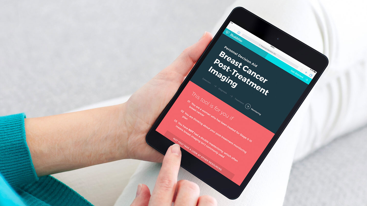
SIMBA Decision Aid
UX Design
Client: Group Health Research Institute (GHRI)*
Timeline: 7 weeks
A web-based, personalized decision aid that helps America’s 3 million breast cancer survivors decide which post-treatment monitoring option is best for them.
SIMBA: Surveillance Imaging Modalities for Breast Cancer Assessment
* GHRI is now Kaiser Permanente Washington Health Research Institute
Artefact Team
Dave McColgin |
Aaron Tinling |
Awards
Notable, Design Concept |
Press
Post-Cancer Checkups Are Stressful—This Decision Aid Is Designed To Help Follow-up |
This Tablet Can Help Make Post-Diagnosis Decisions |
My role:
- One of 2 UX designers on the team |

It's Not Over
– Life after breast cancer treatment

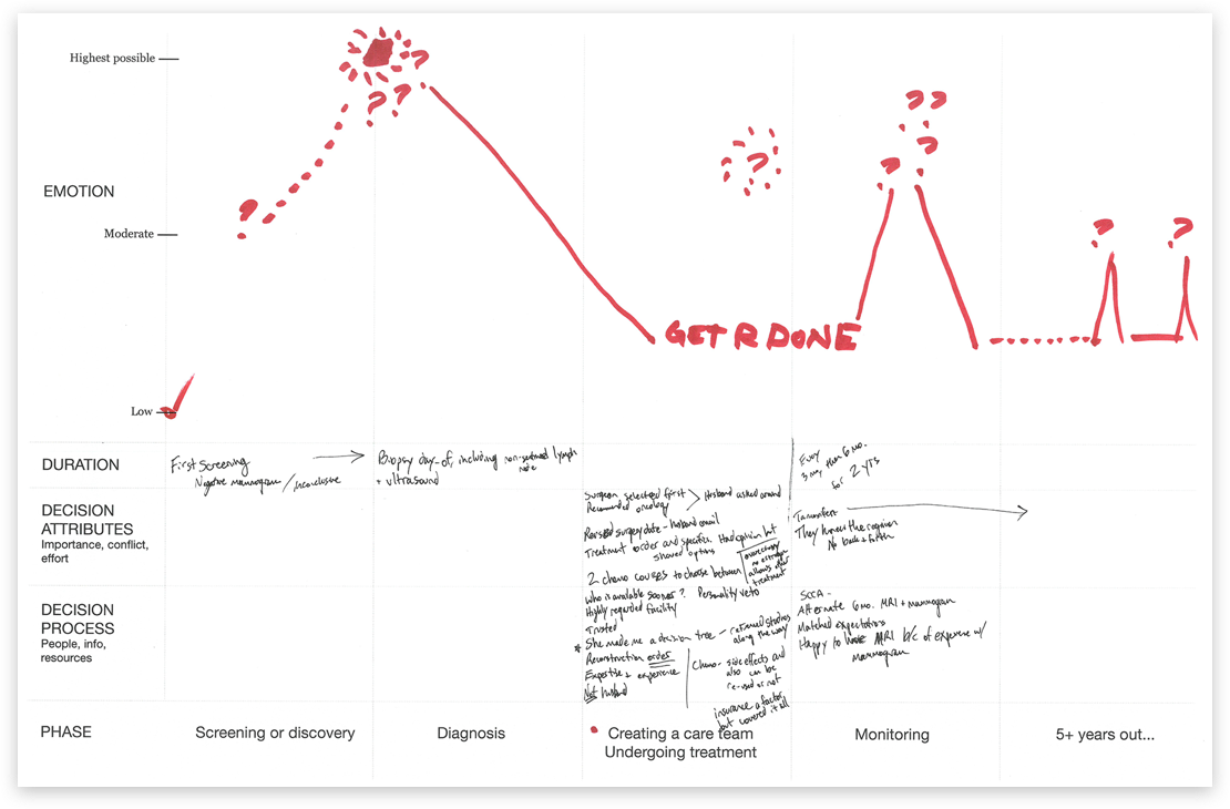
Even after a woman survives breast cancer – the stressful diagnosis, the painful treatment, and the slow recovery – it still isn’t over.
Routine monitoring, by mammography and MRI, needs to take place for years after treatment is finished. This step is especially important the first 5 years after treatment, when the risk of recurrence is the highest.
Routine monitoring, by mammography and MRI, needs to take place for years after treatment is finished.

Contact with the care team becomes less frequent after treatment, but emotional distress over fear of recurrence still remains.
“I never got nervous before doctor's appointments. Now I literally shake.”
– Breast cancer patient from primary research
A new state of vulnerability
Through our interviews with breast cancer patients, we learnt that the feeling of accomplishment upon completing treatment is also accompanied by a growing sense of vulnerability as contact with their care team becomes less frequent.
_
The SIMBA Decision Aid helps patients feel more confident and informed during this new state of vulnerability by providing comprehensive, factual information about the next big decision they have to make after treatment – selecting their post-treatment monitoring plan.
Audio excerpts from our primary research sessions with breast cancer patients
The not-so-simple decision
after breast cancer treatment
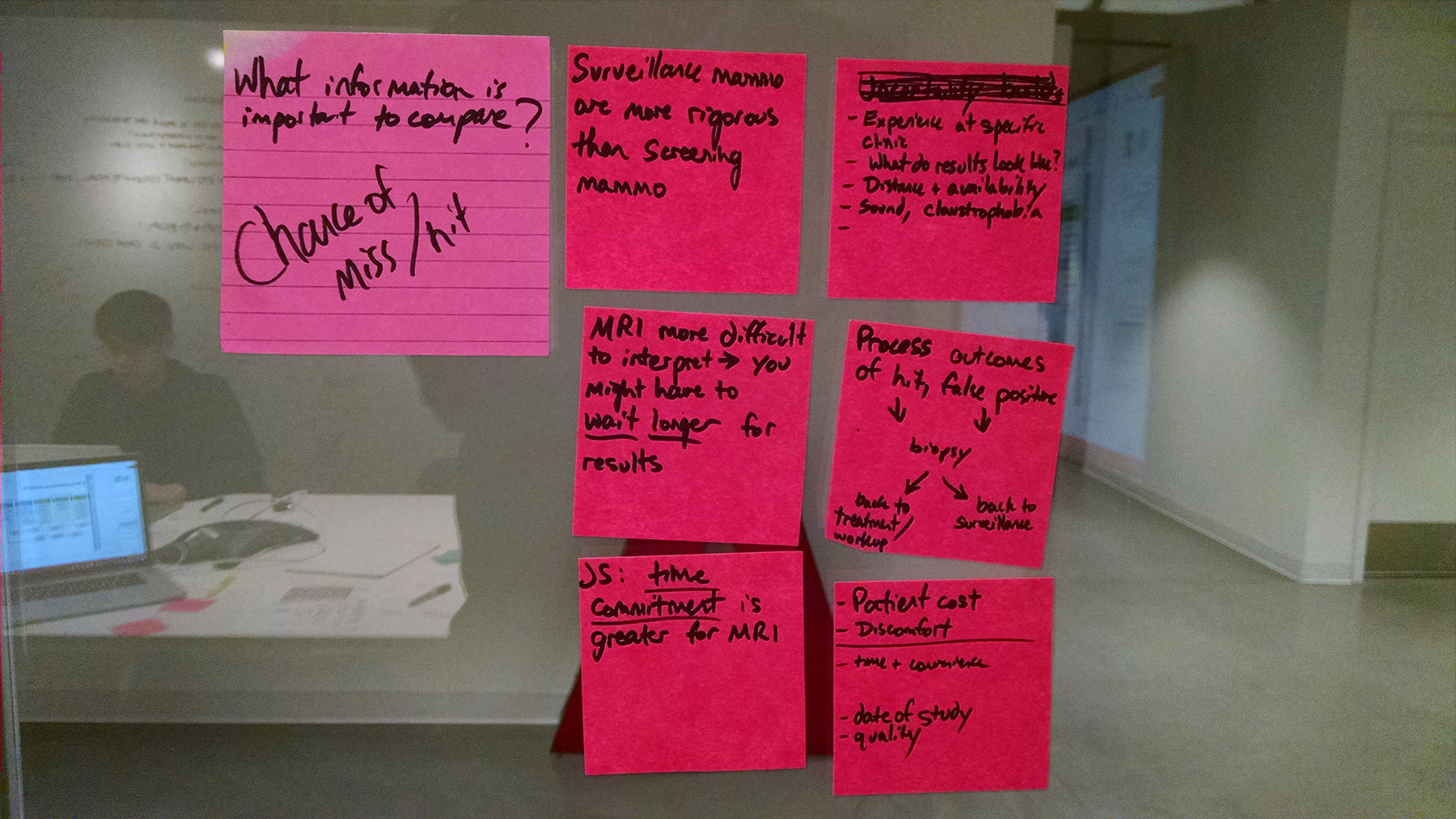
At first glance it seems like an easy choice – choosing mammograms and breast MRIs means more imaging, which should be the best chance of detecting new or returning cancer.

But there are important downsides to breast MRIs, including cost, time, and an increased risk of false positives, which can lead to unnecessary biopsies. There’s also a lack of clinical evidence supporting their use.
It’s a difficult decision – and women are often making it while dealing with extreme fatigue and “chemo brain” as treatment comes to an end.


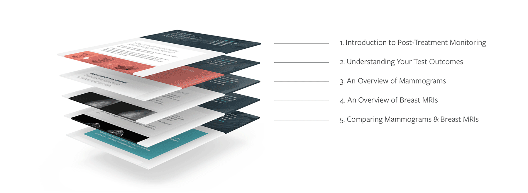
Designing for a linear interaction flow with specific pause points
As we came out of our week long of primary research sessions, I started exploring different ways of laying out information, helping the team define the interaction model that would be used for the decision aid.
We converged on a wizard-like model, as it provided a guided structure that allowed patients to dive deep into the learning content while having a clear start/end point that gets them in & out of the tool in an efficient manner.

Providing an accessible entry point
into a complex topic
Usability tests with a range of breast cancer patients revealed that they preferred comprehensive, detailed information over quick, bite-sized content. Comprehensive factual information provided a sense of assurance that made them feel more confident and better informed.

A “card metaphor” was used to help semantically organize topics for readability. Large headers, often phrased as questions, help orient the user to the content in that section of the tool.
This modular approach helps make complex content more accessible. It is also well-suited to content changes as information improves.
“Oh it’s personalized to me! I like that. I’d have been much more interested if I knew this from the beginning.”
– Feedback from a participant in one of the usability studies
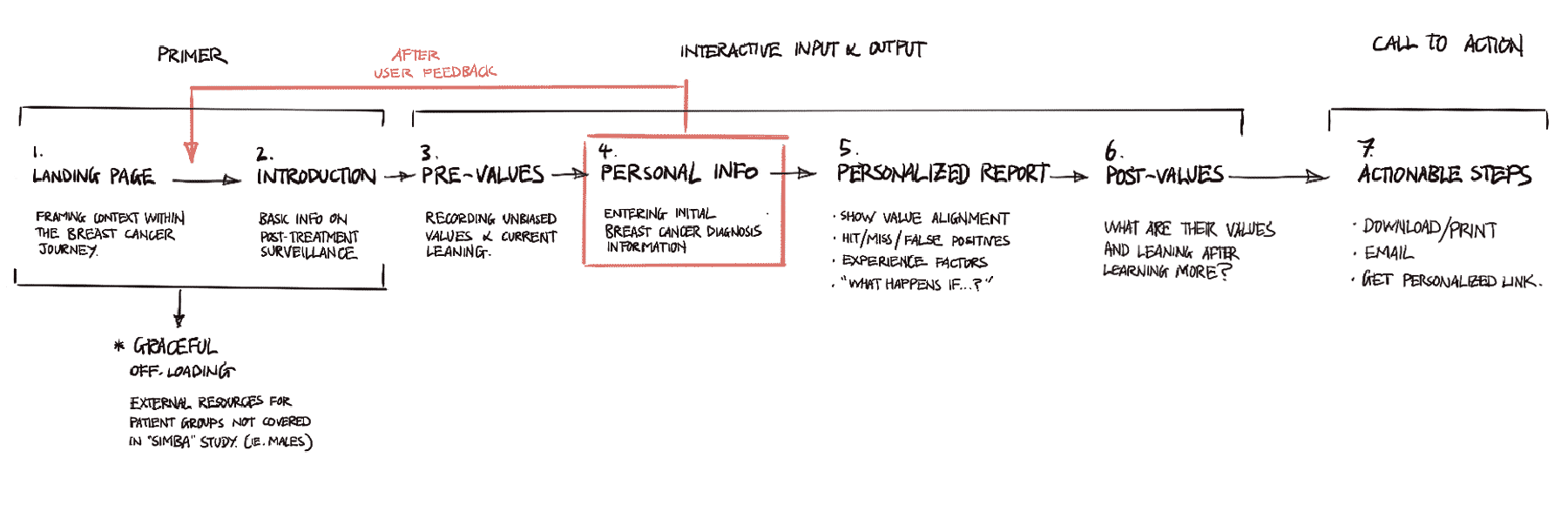
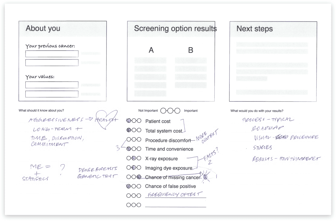
Communicating personal value upfront by front-loading data input
Based on feedback during conversations with patients, we learned that they highly valued the personalization of the tool and saw it as a differentiating feature.
By collecting medical info early in the flow, users are quickly alerted to the fact that they will be receiving tailored, not just generic, results.
This also front-loads the tedious nature of entering personal info, ensuring that users wouldn't need to search for their medical info halfway through using the tool, reducing potential friction in the user experience later on.


An activity sheet filled out by a participant during a primary research session
Turning conflicting priorities into positive conversations
We learnt that patients and physicians often have conflicting priorities – patients want to detect cancer as soon as possible, while physicians want to minimize false positives.
Instead of trying to neutralize personal biases, we designed the tool to allow those personal biases and priorities to be captured and reflected upon. This helps patients have more open and honest discussions with their health care provider, aiding in the decision making process.

“The biggest danger is a false positive.”
– Radiation Oncologist
“I would go through a lot of s**t to have the best understanding of what’s going on with me… it’s totally worth going through [the MRI].”
– Hilary, breast cancer patient


Post-tool reflection
Asking these questions before and after not only provided patient reflection, but also allowed GHRI to capture important data points for future research on the real impact of the tool.
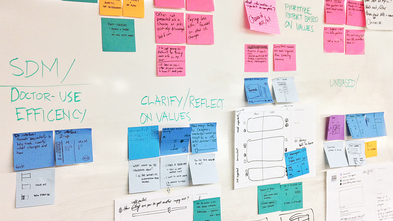
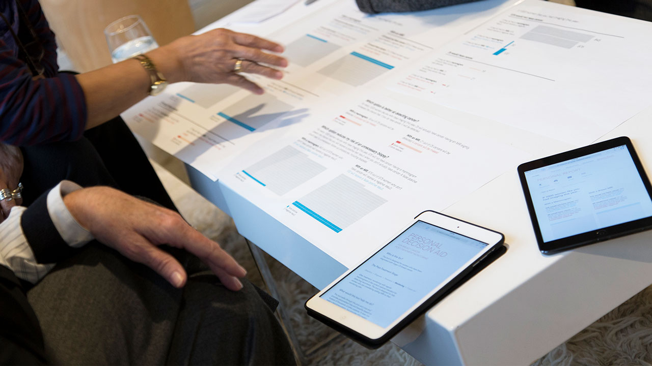
Helping patients prioritize what matters most
After educating the user on mammograms and breast MRIs, the next screen in the site presents a side-by-side comparison of the two options.
In addition, the tool allows the user to mark (with a check) the factors that are most important to her. This action enables the Personal Report page to prioritize the “results” information that is displayed, to match what the user values the most.

Science-backed visualizations
In parallel to the design exploration, the team conducted a deep dive into literature on decision aid best practices.
Insights were also gathered from behavioral economics and cognitive psychology about factors known to bias health decision making and risk perception.


Horizontal Pictographs
Horizontal pictographs produces more accurate data interpretations than vertical pictographs and helps combat biasing effects of powerful narratives.

1000 Unit Scaling
Opting for 1000 person units helps avoid the confusion that frequently occurs with partial shading in 100 person units.

Mixed Framing
Presenting possible outcomes in terms of both potential losses and potential gains to counter biases that occur in information framing.


Our Iterative Process
1
Primary research sessions with multiple breast cancer patients and clinical & surgical oncologists
2
Design reviews with breast cancer patients to provide feedback and suggestions for improvement
3
Working with plain language expert from GHRI to craft content at a maximum 8th grade reading level
4
Using current decision aid best practice checklists (ie. IPDAS checklist) to guide and evaluate our final design
Design Evolution
The design phase for this project moved at a fast pace, with only a few days separating each design iteration and design review.
I was involved till the final iteration of the UX, where it was used for A/B testing before having the UI go through a visual design pass.

Meeting the 2 sets of minimum criteria

Evaluative Study

In addition to collecting feedback on our design during in-person sessions with breast cancer patients, we conducted a randomized controlled trial to compare the impact of our design versus a standard design, frequently used online today.
Women who used our design felt more informed about their decision, and more certain about their best choice.

Decisional Conflict Scale:
Informed Sub-score
Women who used our design were more likely to agree that they knew the benefits of each option, as well as the risks
and side effects compared with the standard design. They also scored 10% higher on the knowledge quiz.
Decisional Conflict Scale:
Uncertainty Sub-score
Women who used the our design felt more clear about what was the best choice for them.
They reported higher agreement that the decision was easy to make, that the decision showed what is important to them, and that they were satisfied with their decision.


Client Feedback
“I greatly appreciate the team’s quick ability to take on a topic area that was new, and your sensitivity in the topic especially in meeting and discussing content with breast cancer patients...
Artefact had an outstanding team and I look forward to work with Artefact on another project”
– Karen Wernli, Client (GHRI)
“I was impressed with the flexibility the team showed. When faced with a potential barrier or simply with new information, you reconfigured with grace and speed, and kept the project moving forward toward its goal.
It has been an honor to work with all of you.”
– Susan Brandzel, Client (GHRI)
About the SIMBA Study
The SIMBA decision aid was designed in partnership with Group Health Research Institute (GHRI), who set out to understand better breast cancer solutions with their SIMBA study (Surveillance Imaging Modalities for Breast Cancer Assessment).
Conducted between 2013 and 2016, the goal of SIMBA was to be the largest-ever analysis of the effectiveness of mammography and breast MRI, then use the data to empower patients to select the right imaging solution. They gathered perspectives of patients and doctors, then began the analysis with 36,000 breast cancer exams.
Learn more about the SIMBA Study